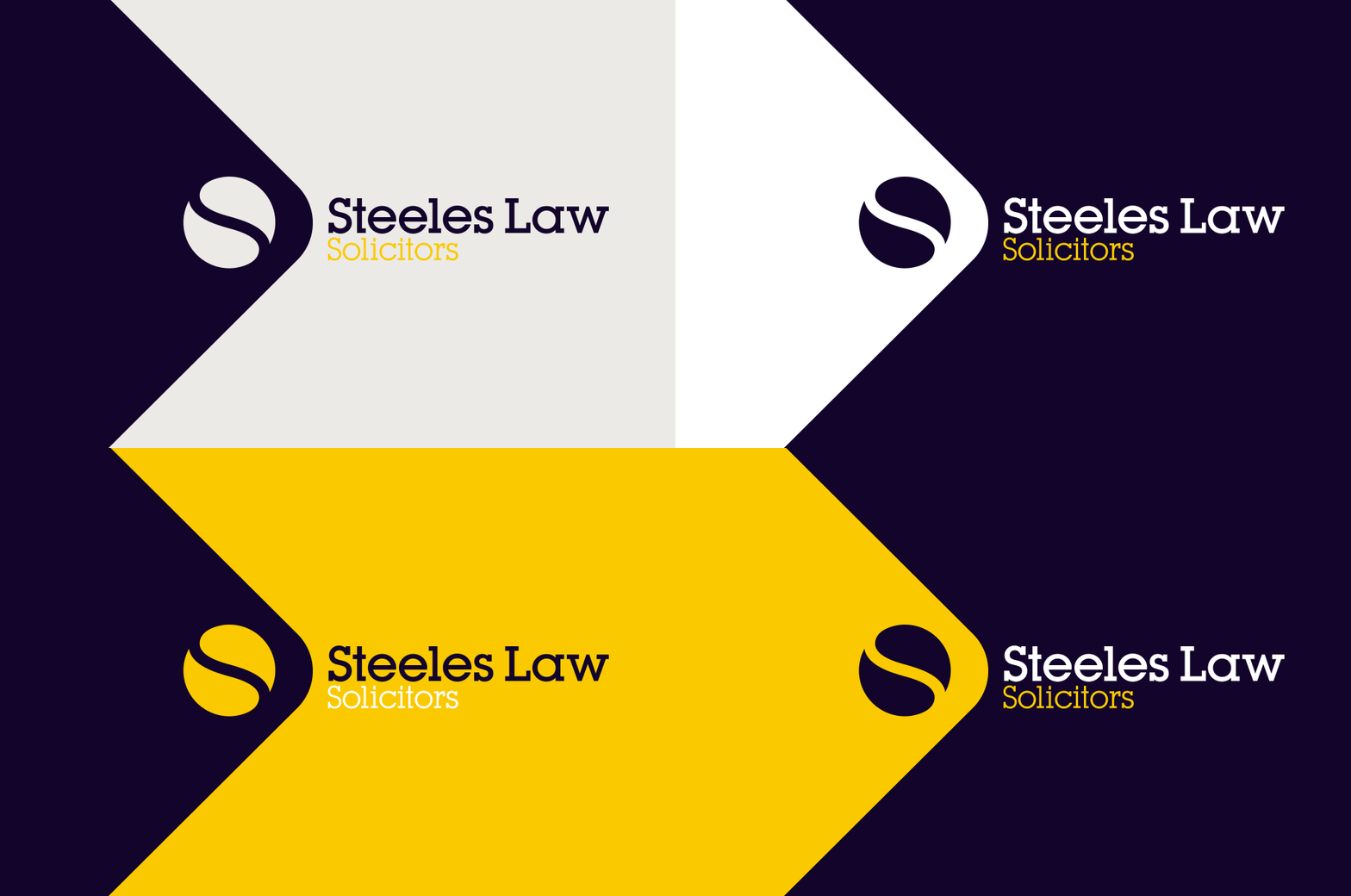
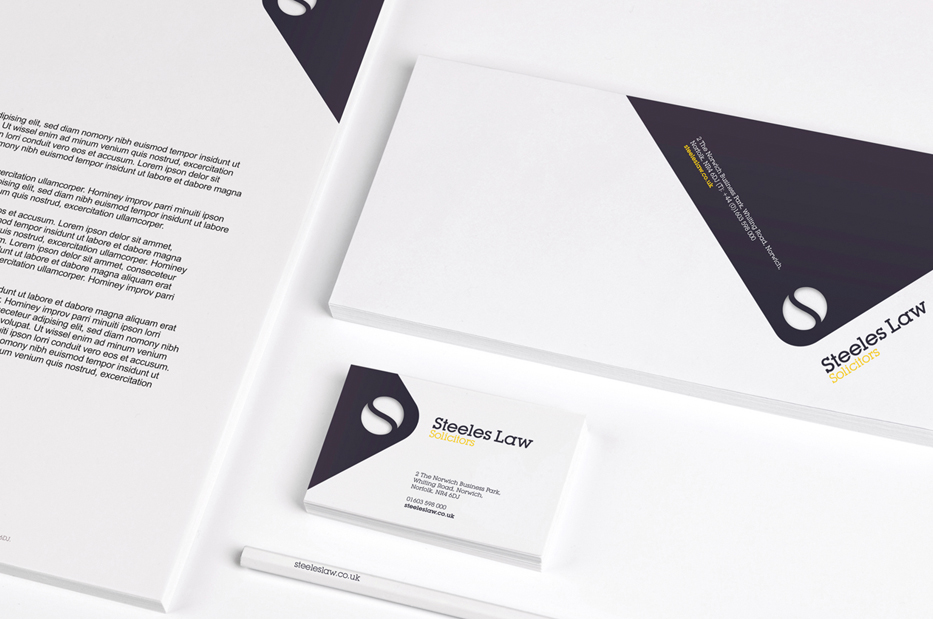
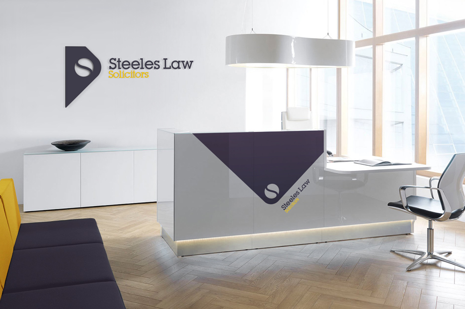
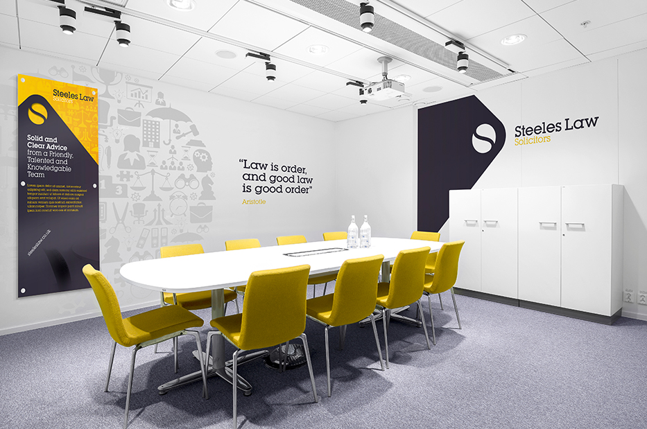
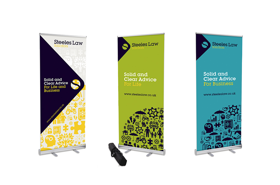
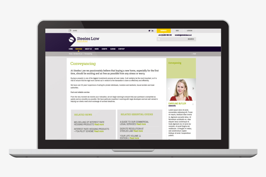
With existing value in their logo, the refreshed brand retains the familiar ‘S’ using a new colour palette of aubergine and mustard. The new identity sits on an angled boilerplate, which can be adapted for individual applications such as signage, stationery or exhibition stands.
Now fully rolled out across Steeles three offices, the new brand is powerful and consistent across multiple platforms and carries the firm forward as leaders in their field.
- Deliverables
- Branding
- Guidelines
- Stationery
- Signage
- Responsive website


